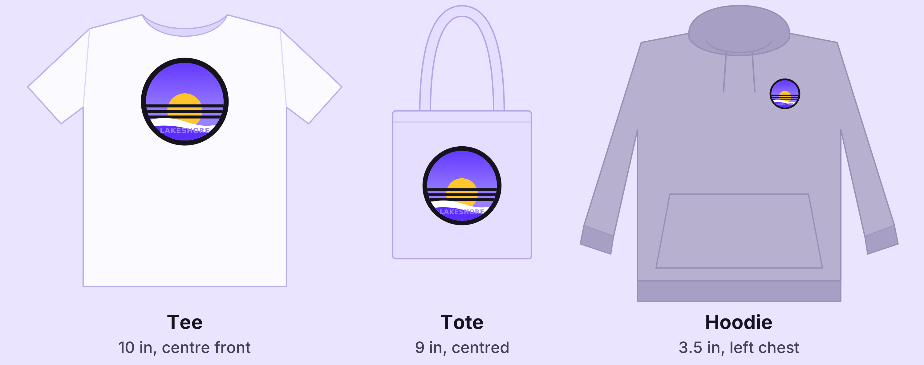
A design that works on a T-shirt doesn't automatically work on a tote bag or a hoodie. The artwork can stay the same; what changes is how big it prints, where it sits and what colour is behind it. Here are those three changes, one at a time, on the same badge.
1. Change the scale
The quickest way to get two looks from one design is size. Across the front at 11 inches, the badge is the whole shirt. On the left chest at 3.5 inches, it's a quiet mark that works with almost anything.
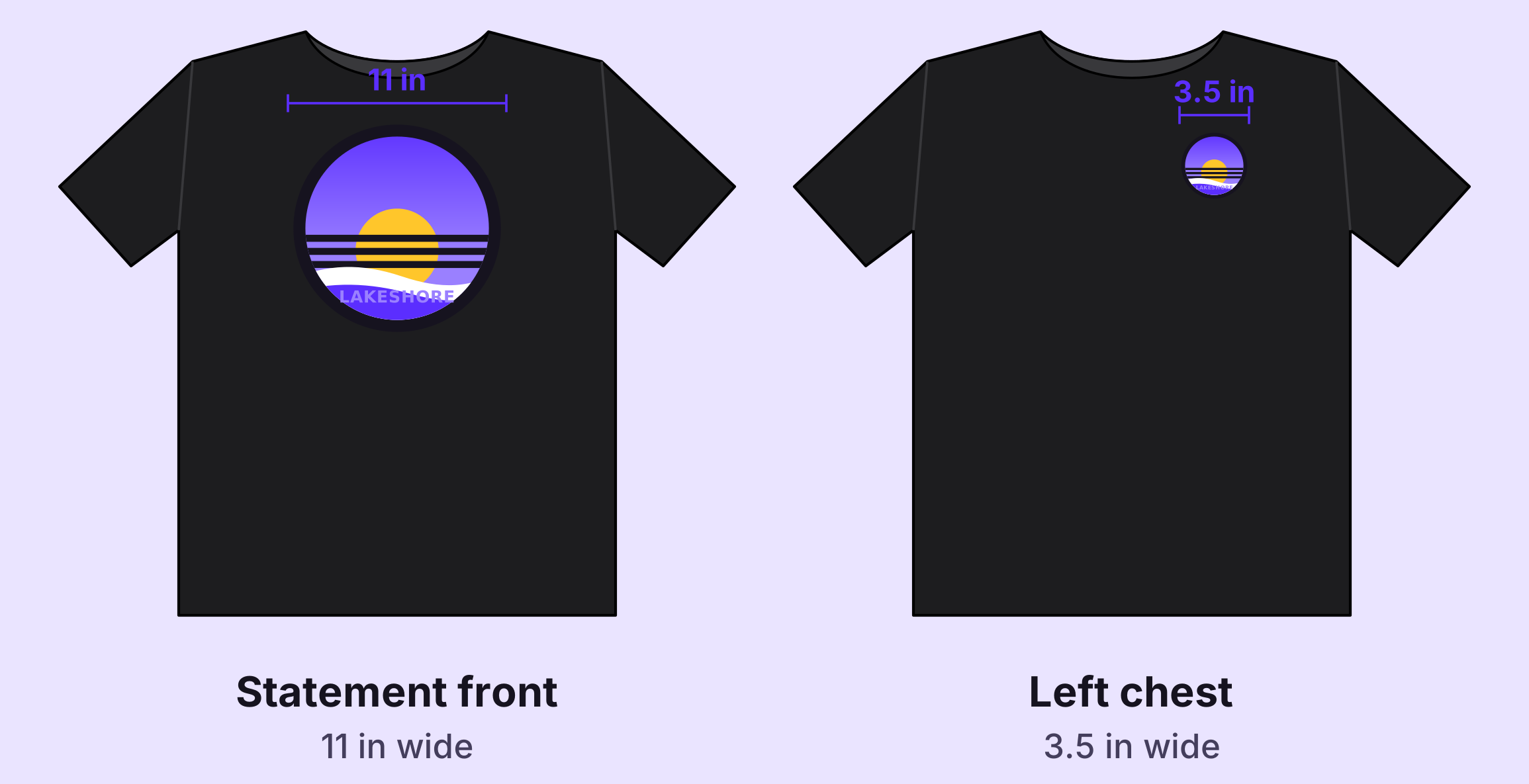
Scale changes more than the size, though. Two things to check:
- Small text gets smaller. At 3.5 inches, the letters in LAKESHORE are about a fifth of an inch tall, and thin outlines turn into hairlines. If a design has fine detail, look at it printed on paper at the smallest size before you order. Some brands keep a simplified version for small placements.
- Start from the biggest size. A file with enough pixels for 11 inches has plenty for 3.5 inches. The reverse isn't true: a small file stretched to 11 inches prints soft.
2. Change the placement
Each product has its own best spot, and it's usually decided by what's in the way.
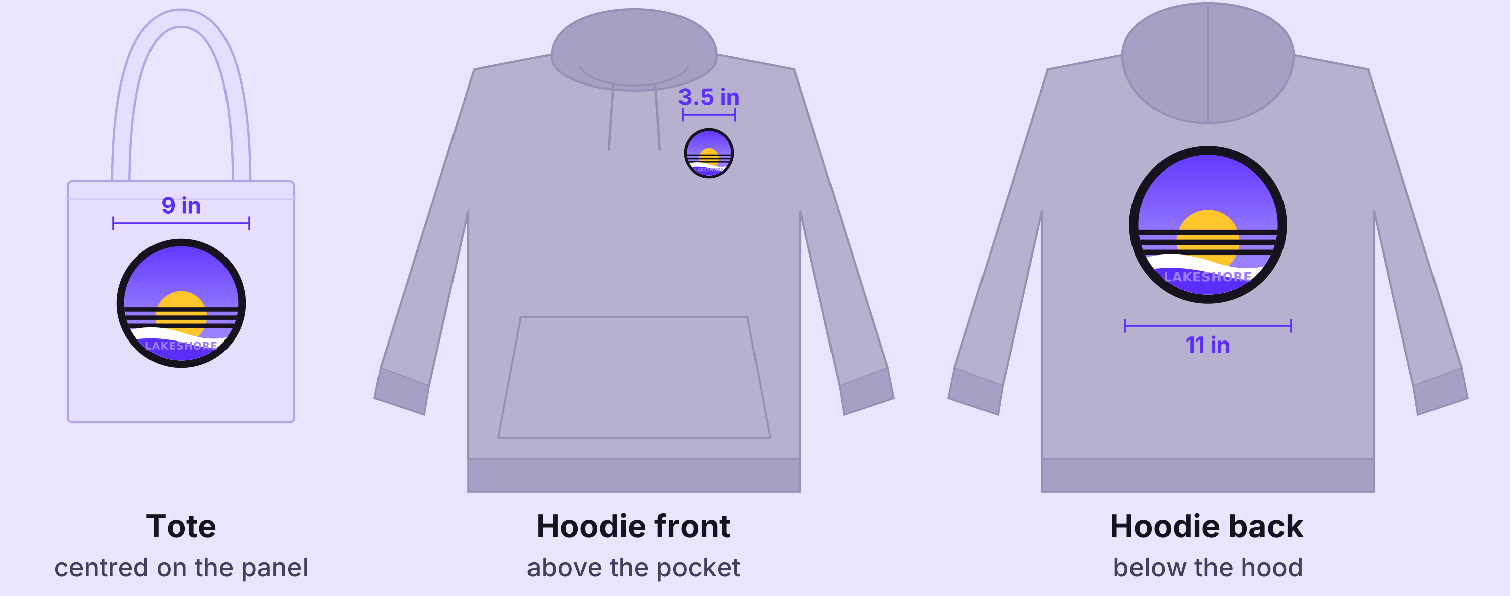
- Tote: a flat panel with seams on three sides and handles at the top. Centre the design and leave a margin to the seams. At 9 inches the badge fills this 15-inch-wide tote without crowding it.
- Hoodie front: the pocket and drawstrings take the middle of the chest, so a big centred print either sits awkwardly high or runs into the pocket. A left-chest badge avoids both.
- Hoodie back: the largest flat area on any of the three. Start the design a few inches below where the hood joins, so it isn't hidden when the hood is down.
Put together, a hoodie can carry the badge twice: small on the front, large on the back. That is two transfers of one design at two sizes, which brings us to the gang sheet.
3. Change for the garment colour
The same artwork can look finished on one colour and unfinished on another. Here it is at 10 inches on four tees.
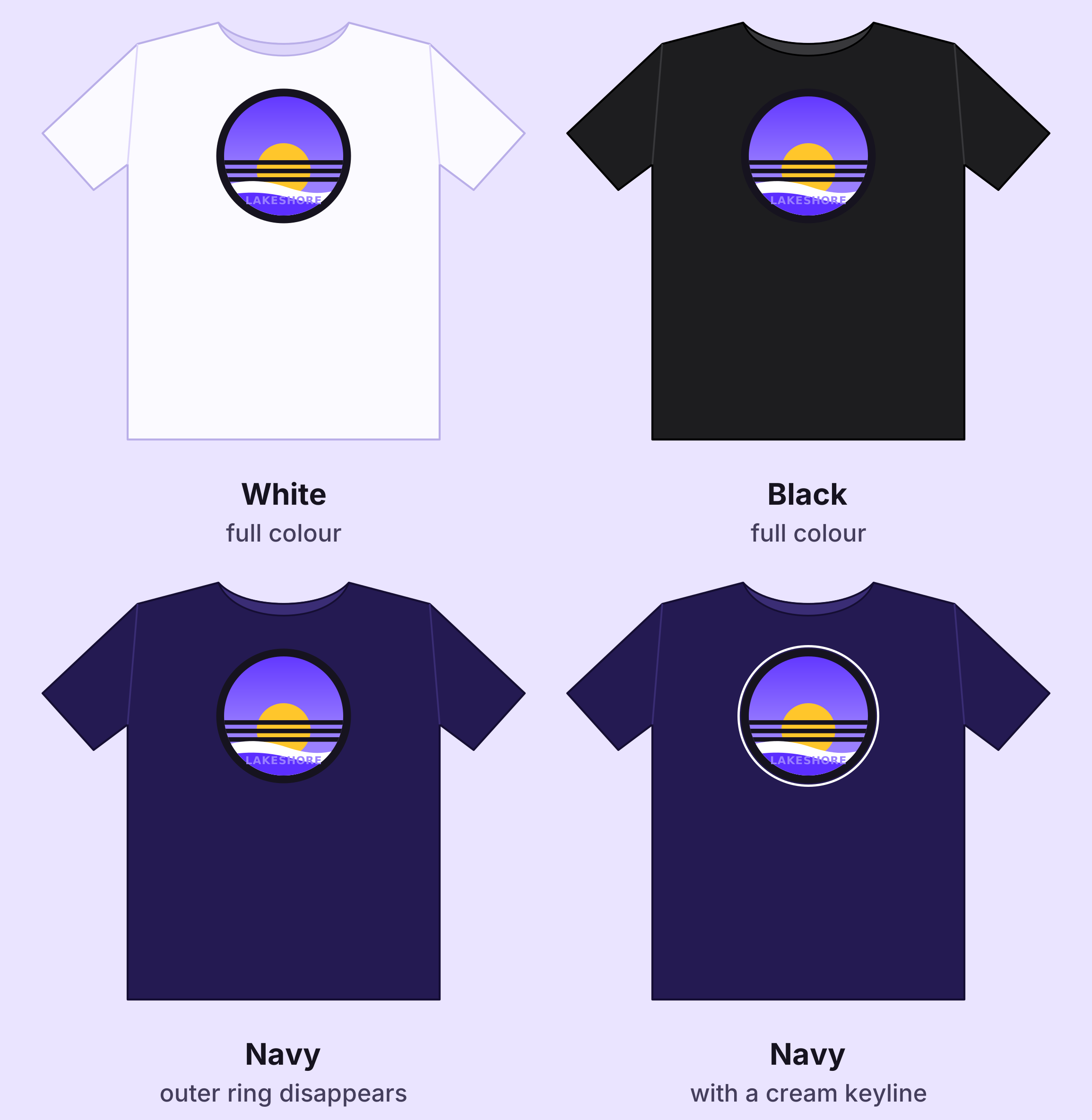
On white and black, the full-colour badge holds its shape: its dark ring frames it on white, and the bright centre stands out on black. On navy, the ring is almost the same colour as the shirt, so it vanishes and the badge looks smaller and less finished. The fix is a second version of the artwork with a thin light outline, a keyline, around the edge, used only on dark garments that match the ring.
The test is simple: look at every colour that touches the outside edge of the design, and ask whether it is close to the garment colour. If it is, that edge will disappear. Colours also shift between a glowing screen and fabric, so if colour matters, print a short test sheet first and press a sample.
Putting it on one gang sheet
All of these can go on the same 24-inch gang sheet: the badge at 11, 10, 9 and 3.5 inches, plus the keyline version for navy. In the gang sheet builder, add both PNGs once, then place as many copies as you need and set each copy's width in inches. Size every copy for the product it's going on, and the print file is made at exactly that size.
Working out how many of each to print is a planning question more than a design one. For a worked example with real quantities and sheet lengths, see what goes into a small merch run for a Toronto event.
At a glance
| Product | Placement | Width | Artwork |
|---|---|---|---|
| Tee | Centre front | 10–11 in | Full colour; keyline on navy |
| Tee | Left chest | 3.5 in | Full colour; check small text |
| Tote | Centred | 9 in | Full colour |
| Hoodie | Left chest | 3.5 in | Match to hoodie colour |
| Hoodie | Back, below the hood | 11 in | Match to hoodie colour |